
Learning Center
How to simulate a time series?
A random time series is a time ordered sequence of random numbers. In SAFE TOOLBOXES® a sample of a time series can be represented by a column or a row vector inserted in some Excel cells.
You can generate a vector containing a time series by your own, or you can enter some predefined time series process, like the Geometric Brownian Motion, directly by the corresponding function or via the insert button menu available in the Simulation Toolbox tab. There are also some thematic random time series spread throughout the toolboxes, such as a vector of actuarial cash flows in the Actuarial Toolbox or a vector of future short-term interest rates in the Financial Toolbox.
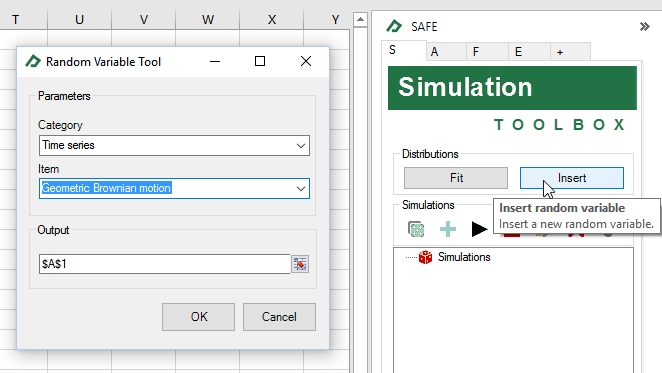
To demonstrate the generation of a time series, let’s generate a Geometric Brownian Motion using the insert button (see picture below). The first step is to select the Geometric Brownian Motion under the time series and then chose a destination cell to receive the series, let's say, cell A1.
Now, expand a little the size of the inserted time series by copying the formulas in cells A9:B9 and paste them into the cells A10:B38.
A |
B |
C |
D |
|
1 |
Geometric Brownian motion |
|
|
|
2 |
Last price |
$ 100.00 |
|
|
3 |
Drift |
1.0 % |
|
|
4 |
Volatility |
1.0 % |
|
|
5 |
Time interval |
1.00 |
|
|
6 |
|
|
|
|
7 |
Time |
Series |
|
|
8 |
0.00 |
$ 100.00 |
=$B$2 |
|
9 |
1.00 |
$ 98.99 |
=sRAND_GeometricBrownianMotionProcess(B8,$B$3,$B$4,$B$5) |
|
10 |
2.00 |
$ 100.86 |
|
|
11 |
3.00 |
$ 101.76 |
|
|
12 |
4.00 |
$ 102.26 |
|
|
13 |
5.00 |
$ 101.49 |
|
|
14 |
6.00 |
$ 102.49 |
|
|
15 |
7.00 |
$ 101.71 |
|
|
16 |
8.00 |
$ 102.06 |
|
|
17 |
9.00 |
$ 103.03 |
|
|
18 |
10.00 |
$ 103.49 |
|
|
19 |
11.00 |
$ 104.95 |
|
|
20 |
12.00 |
$ 106.68 |
|
|
21 |
13.00 |
$ 106.22 |
|
|
22 |
14.00 |
$ 106.11 |
|
|
23 |
15.00 |
$ 107.77 |
|
|
24 |
16.00 |
$ 107.20 |
|
|
25 |
17.00 |
$ 110.20 |
|
|
26 |
18.00 |
$ 110.33 |
|
|
27 |
19.00 |
$ 109.28 |
|
|
28 |
20.00 |
$ 109.04 |
|
|
29 |
21.00 |
$ 110.24 |
|
|
30 |
22.00 |
$ 111.51 |
|
|
31 |
23.00 |
$ 112.41 |
|
|
32 |
24.00 |
$ 112.32 |
|
|
33 |
25.00 |
$ 113.44 |
|
|
34 |
26.00 |
$ 114.40 |
|
|
35 |
27.00 |
$ 116.68 |
|
|
36 |
28.00 |
$ 117.39 |
|
|
37 |
29.00 |
$ 117.43 |
|
|
38 |
30.00 |
$ 118.75 |
|
|
39 |
|
|
|
|
Then, select cells B8:B38 and click on the start simulation button. The chart ![]() provides a great view of the evolution of your time series. Remember that you can double click the chart to enlarge it.
provides a great view of the evolution of your time series. Remember that you can double click the chart to enlarge it.
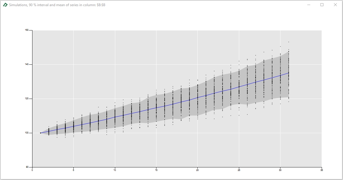
In this chart, the dots represent the simulated values of the time series for each time of the simulation. The blue line is the mean of the simulations and the gray area is the 5%-95% interval of the simulated values of the time series.