Learning Center
How to use color pallets to highlight statistical properties in charts and cells?
Sometimes, a proper visualization of your data can facilitate a lot your analysis or wow the appearance of your reports. SAFE TOOLBOXES® comes with three types of color pallets: qualitative, divergent and sequence.
The use of the qualitative pallet is recommended when the data does not have any kind of hierarchy. The divergent pallet is recommended when the data oscillate between opposite extremes with a clear meaning and you want to highlight this — e.g., good and bad, high and low, etc. —. Finally, the sequence pallet is useful in situations where you want to show the progression in your data without given emphasis in the extremes.
All pallets can be applied in three kinds of objects:
- All chart series
- The values of one chart series
- A group of cells
The color intensity depends on the distribution of the underlying data. In this sense, you can run the procedure using a uniform distribution, to give equal weights to your data, or a normal distribution, to emphasize the extreme values.
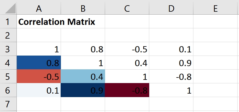
So, for instance, if we want to colorize the correlation matrix below, just follow these steps:
A |
B |
C |
D |
E |
|
1 |
Correlation Matrix |
|
|
|
|
2 |
|
|
|
|
|
3 |
1 |
0.8 |
-0.5 |
0.1 |
|
4 |
0.8 |
1 |
0.4 |
0.9 |
|
5 |
-0.5 |
0.4 |
1 |
-0.8 |
|
6 |
0.1 |
0.9 |
-0.8 |
1 |
|
7 |
|
|
|
|
|
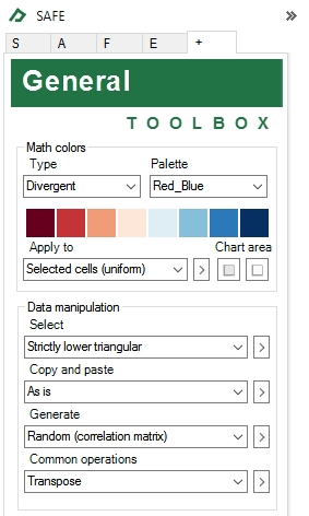
- Set the “Apply to” field to “Selected cells (uniform)”
- Go to the General Toolbox and in the “Math Colors” group select type = “Divergent” and “Palette” = “Red_Blue”
- Select the range A3:D6 and to exclude the upper diagonal use the matrix selection tool and choose select = “Strictly lower triangular”
The result will be similar to this:
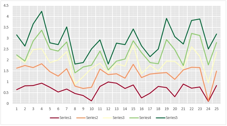
Now, considering the following chart:
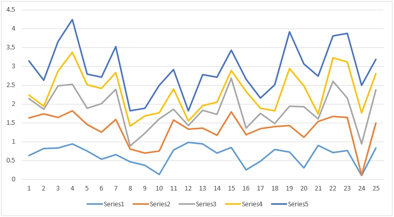
To use the same idea and change the line colors of the chart above, just perform these steps:
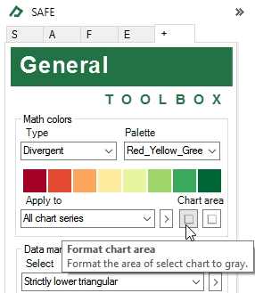
- Go to the General Toolbox and in the “Math Colors” group select type = “Divergent” and “Palette” = “Red_Yellow_Green”;
- Select the chart and set the “Apply to” field to “All chart series”; and
- To give a professional touch, click on the button format chart area.
And the result will be: